We are often asked for specs when a client wants to design an email for their program that will be delivered for notification or a greeting.
That is a loaded question as, with most web items, there are really no specs.
We do not want to limit you on a design in ANY of our programs, so we do not lock down our specs and tell you that a header must be xx px tall and yy px wide. We want to give you some flexibility.
However, there are certain things that are pretty standard for a webpage that you cannot do in email. HTML for email is not the same HTML for the modern web. HTML for email more closely resembles HTML from 1996.
So here are some tips
- Keep it simple – Focus on the message versus branding in the email.
- Tables are your friend – Keep it simple, because email programs use different HTML rendering engines. The web has 4 main browsers that we have compatibility worries, but the email world has at least 25 different clients that all render HTML differently. Even Outlook uses a different engine from 2007 to 2010. Outlook 2010 can display a background image, but Outlook online can’t. So keeping it simple will make sure your email looks the same in all email clients. So, as in 1996, we must use a lot of Tables to display everything correctly.
- Don’t design your emails too wide. Main email clients have a preview pane that is narrow. Many people are now almost exclusively checking their email on their mobile device. Wishoo suggests 600px or less in width for most emails.
- Use more native text than images – Most email clients do not automatically display images. While we make proper use of alt tags, an alt tagged image is ugly and you want to make a good first impression. We suggest a simple header image and then possibly a footer, if desired.
- We use a lot of variable text, so don’t design the entire email as an image – We put in links that are variable within greeting emails or customize the email with a first name, so if you have designed the email to be very image heavy witha lot of custom fonts, we cannot use that design when sending variable data. We need to be able to replace text on the fly. See Tip #1! Keep it simple!
- CSS Wont Work – Many clients will not support CSS. So that means we cannot do crazy stuff in an email like a background image or custom font. Again, think 1996.
- SPAM – Again see Tip #1. (sensing a theme here?) In addition to words like FREE or other key words, spam filters also look for stuff like, “do you have too many images, and not enough text?” A simple email will help avoid the dreaded spam filter.
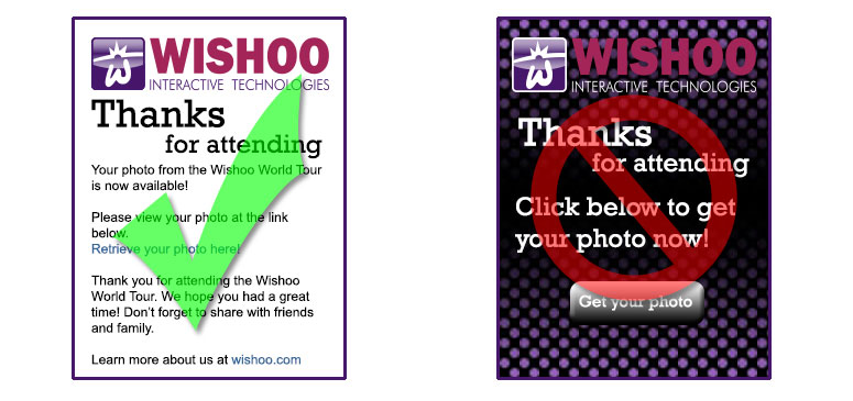
As you can see from the above (simplified) example, stay away from heavy graphic design and custom fonts for the email and focus on simple. While the fancier email certainly has a visual appeal, it will have a higher risk of not being read due to some clients not displaying it correctly, or simply not being delivered.
If you have questions, feel free to contact us!
Get Social